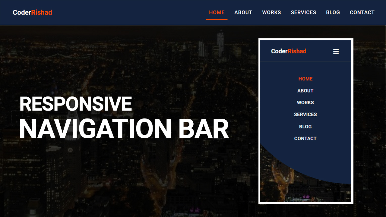
Welcome to our tutorial on building a Responsive Navigation Menu Bar using HTML, CSS, and jQuery! In today’s digital landscape, ensuring your website looks fantastic and functions smoothly on any device is crucial. A responsive navigation menu is a key component to achieving this goal.
Throughout this guide, you’ll discover:
- Setting up the HTML Framework: Learn how to structure your HTML to create a responsive navigation menu that adapts seamlessly to different screen sizes.
- Styling with CSS: Explore fun techniques to style your menu using CSS, giving it a modern and polished appearance that matches your website’s design.
- Adding Interactivity with jQuery: Dive into jQuery to implement interactive features like dropdowns or menu toggles, enhancing the usability of your navigation, especially on smaller screens.
By the end of this tutorial, you’ll have a responsive navigation menu bar that will impress your visitors and make navigating your site a breeze, no matter what device they’re using.
Responsive Navigation Menu Bar using HTML CSS & jQuery
If you want to create a responsive Navigation Menu Bar Design using HTML CSS & jQuery, you can follow the steps below to easily create the Navigation bar.
Step 1: HTML Setup
First, create an HTML file with the name index.html and paste the given codes into your HTML file for Responsive Navigation Menu Bar. Remember, you’ve to create a file with .html extension.
HTML CODE:
<!DOCTYPE html>
<html lang="en">
<head>
    <meta charset="UTF-8">
    <meta http-equiv="X-UA-Compatible" content="IE=edge">
    <meta name="viewport" content="width=device-width, initial-scale=1.0">
    <title>Responsive Navigation bar design usign html & css & javascript</title>
    <link href="https://fonts.googleapis.com/css2?family=Roboto:wght@400;500;700&display=swap" rel="stylesheet">

    <!-- font awesome cdn -->
    <link rel="stylesheet" href="https://use.fontawesome.com/releases/v5.15.4/css/all.css">
    <link rel="stylesheet" href="css/style.css">
</head>
<body>
    <header class="header-area">
        <div class="header-container">
            <div class="site-logo">
                <a href="#">Coder<span>Rishad</span></a>
            </div>
            <div class="mobile-nav">
                <i class="fas fa-bars"></i>
            </div>
            <div class="site-nav-menu">
                <ul class="primary-menu">
                    <li><a href="#" class="active">Home</a></li>
                    <li><a href="#">About</a></li>
                    <li><a href="#">Works</a></li>
                    <li><a href="#">Services</a></li>
                    <li><a href="#">Blog</a></li>
                    <li><a href="#">Contact</a></li>
                </ul>
            </div>
        </div>
    </header>

    <section id="hero-section"></section>
    <script src="https://code.jquery.com/jquery-3.6.0.min.js"></script>
    <script type="text/javascript" src="app.js"></script>
</body>
</html>
Step 2: CSS Styling
Now, create a CSS file with the name style.css and paste the given codes in your CSS file for Responsive Navigation Menu Bar. Remember, you’ve to create a file with .css extension.
CSS CODE:
*{
    margin: 0;
    padding:0;
    box-sizing: border-box;
}
body{
    font-size: 18px;
    font-family: 'Roboto', sans-serif;
}
.header-area {
    background: #142440;
    width: 100%;
    padding: 12px 30px;
    z-index: 999;
    border-bottom: 2px solid #909090ad;
    box-shadow: 0px 0px 7px 3px red;
}
.header-container {
    display: table;
    width: 100%;
    margin: auto;
}
.site-logo {
    float: left;
    padding: 17px 0px;
}
.site-logo a {
    color: #fff;
    text-decoration: none;
    font-size: 24px;
    font-weight: 600;
    padding: 15px;
}
.site-logo span {
    color: #ff4a04;
}
.site-nav-menu {
    float: right;
}
.primary-menu{
    list-style: none;
}
.primary-menu li {
    display: inline-block;
    margin: 21px 5px;
}
.primary-menu a {
    color: #fff;
    position: relative;
    text-decoration: none;
    text-transform: uppercase;
    font-weight: 500;
    letter-spacing: 1px;
    padding: 15px 10px;
    transition: .5s;
}
.primary-menu a:hover,
.primary-menu .active {
    color:#ff4a04;
}
.primary-menu li a:after {
    content: "";
    position: absolute;
    width: 0%;
    height: 2px;
    background: #ff4a04;
    bottom: 0px;
    left: 0;
    transition: all .5s;
}
.primary-menu li a:hover:after {
    width: 100%;
}
.primary-menu li .active:after{
    width: 100%;
}
.mobile-nav{
    display: none;
}
.mobile-nav i{
    float: right;
    margin: 10px;
    padding: 10px;
    font-size: 24px;
    color: #fff;
    outline: none;
    cursor: pointer;
}


section#hero-section {
    width: 100%;
    height: 100vh;
    background: url(../img/ny_nu1it.jpg);
    background-repeat: no-repeat;
    background-size: cover;
    background-position: center center;
}

/* Responsive css */

@media only screen and (max-width: 900px) {
    .site-nav-menu {
        float: none;
        position: absolute;
        background: #142440;
        width: 100%;
        left: 0;
        top: 85px;
        padding: 30px 0px 150px 0px;
        border-top: 1px solid #4a4848;
        clip-path: circle(0% at 100% 0%);
        transition: all .8s;
    }
    .primary-menu li {
        display: block;
        text-align: center;
        margin: 25px 5px;
    }
    .mobile-nav{
        display: block;
    }
    .mobile-menu {
        clip-path: circle(112% at 100% 0%);
    }
    .primary-menu li a:after{
        display: none;
    }
}
Step 3: JavaScript Functionality
After then, Create a Javascript file with the name of app.js and paste the given codes in your Js file for Responsive Navigation Menu Bar. Remember, you’ve to create a file with .js extension.
JAVASCRIPT CODE:
$(document).ready(function(){
    $(".mobile-nav i").click(function(){
        $(".site-nav-menu").toggleClass("mobile-menu");
    });
 });
