Welcome to our tutorial on how to create a responsive coming soon page using HTML, CSS, and JavaScript! A well-designed coming soon page is crucial for building anticipation and providing essential information to your visitors while your website is under construction. It helps you create a buzz and engage your audience even before your official launch.
In this guide, you’ll discover:
- Setting up the HTML Structure: Learn how to structure your HTML to create a robust foundation for your coming soon page.
- Styling with CSS: Explore techniques to style your page using CSS, ensuring it looks modern, polished, and responsive across all devices.
- Adding Interactivity with JavaScript: Dive into JavaScript to add interactive elements, such as countdown timers and animations, enhancing the user experience.
By the end of this tutorial, you’ll have a fully functional and visually appealing coming soon page that adapts seamlessly to different screen sizes and devices. Whether you’re preparing for a new website launch or updating your current site, this responsive coming soon page will keep your audience informed and excited.
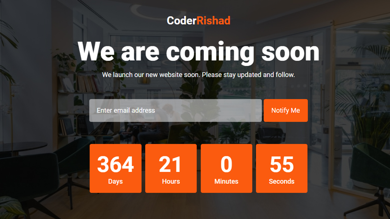
Responsive Coming Soon Page Design using HTML CSS & JavaScript
If you want to make a Responsive Coming Soon Page using HTML CSS & JavaScript, then you have to follow the steps which are given below. Using these steps, you can easily create the Coming Soon Page.
Step 1: First, create an HTML file with the name index.html and paste the given codes in your HTML file. Remember, you’ve to create a file with .html extension.
HTML CODE:
<!DOCTYPE html>
<html lang="en">
<head>
    <meta charset="UTF-8">
    <meta http-equiv="X-UA-Compatible" content="IE=edge">
    <meta name="viewport" content="width=device-width, initial-scale=1.0">
    <title>Responsive Coming Soon Page Design using HTML CSS & JavaScript | CoderRishad</title>
    <!-- font -->
    <link href="https://fonts.googleapis.com/css2?family=Roboto:wght@300;400;500;700;900&display=swap" rel="stylesheet">
    <!-------- Custom css -------->
    <link rel="stylesheet" href="css/style.css">
</head>
<body>

    <section class="coming-soon-area">
        <div class="container">
            <div class="cs-content">
                <div class="site-logo">
                    <a href="#">
                        Coder<span>Rishad</span>
                    </a>
                </div>
                <h1>We are coming soon</h1>
                <p>We launch our new website soon. Please stay updated and follow.</p>
                <div class="form">
                    <form action="#">
                        <input type="email" class="email-field" name="email" placeholder="Enter email address" required>
                        <input type="submit" value="Notify Me">
                    </form>
                </div>
                <div class="countdown-timer">
                    <div class="timer-item">
                        <div class="days">
                            <h3>00</h3>
                            <span>Days</span>
                        </div>
                    </div>
                    <div class="timer-item">
                        <div class="hours">
                            <h3>00</h3>
                            <span>Hours</span>
                        </div>
                    </div>
                    <div class="timer-item">
                        <div class="minutes">
                            <h3>00</h3>
                            <span>Minutes</span>
                        </div>
                    </div>
                    <div class="timer-item">
                        <div class="seconds">
                            <h3>00</h3>
                            <span>Seconds</span>
                        </div>
                    </div>
                </div>
            </div>
        </div>
    </section>
    <script src="js/app.js"></script>
</body>
</html>
Step 2: Now, create a CSS file with the name of style.css and paste the given codes in your CSS file. Remember, you’ve to create a file with .css extension.
CSS CODE:
/* Global css  start*/
*{
    padding: 0;
    margin: 0;
    box-sizing: border-box;
}
body{
    font-family: 'Roboto', sans-serif;
    font-size: 18px;
}
/* Global css end*/


/* Coming soon area css start */

.coming-soon-area{
    background-image: linear-gradient(#000000bf, #000000bf), url(../images/bg.jpg);
    background-size: cover;
    background-repeat: no-repeat;
    background-position: center center;
    width: 100%;
    min-height: 100vh;
    color: #fff;
    padding: 5px 0px;
}
.container{
    margin: auto;
    text-align: center;
}
.cs-content{
    max-width: 760px;
    margin: auto;
    padding: 25px 30px;
}
.site-logo{
    margin: 22px 0px;
}
.site-logo a{
    font-size: 30px;
    font-weight: 700;
    color: #fff;
    text-decoration: none;
}
.site-logo a span{
    color: #FA5B0F
}
.cs-content h1{
    font-size: 72px;
    font-weight: 900;

}
.cs-content p{
    margin: 10px 35px;
}
.form{
    margin: 50px 0px;
}
.form input{
    background: #ffffff85;
    color: #fff;
    font-size: 18px;
    font-family: 'Roboto', sans-serif;
    border: none;
    outline: none;
    margin: 5px 0px;
    padding: 20px;
    width: 67%;
    border-radius: 5px;
}
.email-field::placeholder{
    color: #fff;
}
.form input[type="submit"]{
    width: 120px;
    background: #FA5B0F;
    color: #fff;
    cursor: pointer;
}
.countdown-timer{
    margin: 35px 0px;
}
.timer-item{
    display: inline-block;
    background: #FA5B0F;
    margin: 5px 3px;
    padding: 20px;
    min-width: 140px;
    font-size: 50px;
    font-weight: 700;
    border-radius: 5px;
}
.timer-item span{
    display: block;
    font-size: 18px;
    font-weight: 500;
}

/* Coming soon area css end */


/* Responsive css start */

@media screen and (max-width: 767px){
    .site-logo{
        margin-bottom: 50px;
    }
    .cs-content h1{
        font-size: 50px;
    }
    .cs-content p{
        line-height: 26px;
        margin: 10px 0px;
    }
    .form input[type="email"]{
        width: 100%;
    }
}
Step 3: After then, Create a Javascript file with the name of app.js and paste the given codes in your Js file. Remember, you’ve to create a file with .js extension.
JAVASCRIPT CODE:
// Set the date we are counting down to
var countdownDate = new Date("Sep 30, 2022 18:01:00").getTime();

var x = setInterval(function(){

    // Get today's date and time
    var nowDT = new Date().getTime();

    // Find the distance between now and the countdown date
    var distance = countdownDate - nowDT;

    // Time calculations for days, hours, munutes and seconds
    var days = Math.floor(distance / (1000 * 60 * 60 * 24));
    var hours = Math.floor((distance % (1000 * 60 * 60 * 24)) / (1000 * 60 * 60));
    var minutes = Math.floor((distance % (1000 * 60 * 60)) / (1000 * 60));
    var seconds = Math.floor((distance % (1000* 60)) / 1000);

    // Output the result
    document.querySelector(".days h3").innerHTML = days;
    document.querySelector(".hours h3").innerHTML = hours;
    document.querySelector(".minutes h3").innerHTML = minutes;
    document.querySelector(".seconds h3").innerHTML = seconds;

    // If the countdown is over, write some text
    if(distance < 0){
        clearInterval(x);
        document.querySelector(".countdown-timer").style.display = 'none';
        document.querySelector(".cs-content h1").innerHTML = 'Welcome';
    }

}, 1000);
