Welcome to our tutorial on creating responsive cards using HTML, CSS, and Bootstrap! In today’s web design landscape, the ability to create responsive cards is essential for presenting content beautifully across different devices. Responsive card layouts ensure that your content looks great and functions smoothly, no matter the screen size.
Throughout this guide, you’ll learn how to create responsive cards step by step:
- Setting up the HTML Structure: Discover how to structure your HTML to create responsive cards components that form the backbone of your design.
- Styling with CSS: Explore various CSS techniques to style your cards, making them visually appealing and adaptable. You’ll learn to create responsive cards that adjust perfectly to any screen size.
- Enhancing with Bootstrap: Dive into Bootstrap to leverage its grid system and utility classes for creating responsive card layouts that are both functional and aesthetically pleasing.
By the end of this tutorial, you’ll have the skills to design and create responsive cards that enhance the presentation of your content on websites and web applications. Whether you’re building a portfolio, an e-commerce site, or a blog, knowing how to create responsive cards will elevate your web design projects.
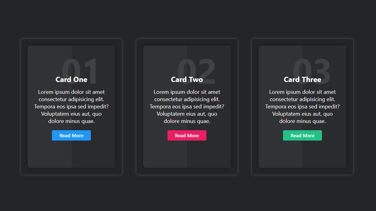
Create Responsive Cards Design using HTML CSS and Bootstrap
If you want to Create responsive cards Design using HTML CSS & Bootstrap, then you have to follow the steps which are given below. Using these steps, you can easily create responsive cards.
Step 1: First, create an HTML file with the name of index.html and paste the given codes in your HTML file. Remember, you’ve to create a file with .html extension.
HTML CODE:
<!DOCTYPE html>
<html lang="en">
    <head>
        <meta charset="UTF-8">
        <meta name="viewport" content="width=device-width, initial-scale=1.0">
        <meta http-equiv="X-UA-Compatible" content="ie=edge">
        <meta name="Description" content="Enter your description here"/>
        <link rel="stylesheet" href="https://cdnjs.cloudflare.com/ajax/libs/twitter-bootstrap/5.1.0/css/bootstrap.min.css">
        <link rel="stylesheet" href="https://cdnjs.cloudflare.com/ajax/libs/font-awesome/5.15.4/css/all.min.css">
        <link rel="stylesheet" href="style.css">
        <title>Responsive Cards Design usign html CSS and Bootstrap | CoderRishad</title>
    </head>
    <body>
        <section id="wrapper">
            <div class="container">
                <div class="row">
                    <div class="col-md-4">
                        <div class="card_area">
                            <div class="single_card">
                                <h2>01</h2>
                                <h3>Card One</h3>
                                <p>
                                    Lorem ipsum dolor sit amet consectetur adipisicing elit. Aliquam placeat eveniet, magnam dicta libero dolore molestias quae deserunt velit nihil!
                                </p>
                                <a href="#" class="btn card_btn1">Read More</a>
                            </div>
                        </div>
                    </div>
                    <div class="col-md-4">
                        <div class="card_area">
                            <div class="single_card">
                                <h2>02</h2>
                                <h3>Card Two</h3>
                                <p>
                                    Lorem ipsum dolor sit amet consectetur adipisicing elit. Aliquam placeat eveniet, magnam dicta libero dolore molestias quae deserunt velit nihil!
                                </p>
                                <a href="https://github.com/coderrishad/navigation_bar1/archive/refs/heads/main.zip" class="btn card_btn2">Read More</a>
                            </div>
                        </div>
                    </div>
                    <div class="col-md-4">
                        <div class="card_area">
                            <div class="single_card">
                                <h2>03</h2>
                                <h3>Card Three</h3>
                                <p>
                                    Lorem ipsum dolor sit amet consectetur adipisicing elit. Aliquam placeat eveniet, magnam dicta libero dolore molestias quae deserunt velit nihil!
                                </p>
                                <a href="#" class="btn card_btn3">Read More</a>
                            </div>
                        </div>
                    </div>
                </div>
            </div>
        </section>

        <script src="https://cdnjs.cloudflare.com/ajax/libs/popper.js/2.9.2/umd/popper.min.js"></script>
        <script src="https://cdnjs.cloudflare.com/ajax/libs/twitter-bootstrap/5.1.0/js/bootstrap.min.js"></script>
    </body>
</html>
Step 2: Now, create a CSS file with the name of style.css and paste the given codes in your CSS file. Remember, you’ve to create a file with .css extension.
CSS CODE:
#wrapper{
    background: #232427;
    padding: 40px 0px;
    min-height: 100vh;
    display: flex;
    vertical-align: middle;
    align-items: center;
    color: #fff;
}
.card_area{
    background: #232427;
    margin: 12px;
    border: 2px solid #232427;
    border-radius: 10px;
    box-shadow: 0px 0px 13px 0px #15535c;
}
.single_card{
    position: relative;
    background: #313236;
    padding: 10px 20px;
    color: #ffffff;
    text-align: center;
    margin: 20px;
    border-radius: 10px;
    box-shadow: 0px 0px 13px 0px #151618;
    z-index: 1;
}
.single_card:after{
    content: "";
    position: absolute;
    background: #2A2B2F;
    width: 50%;
    height: 100%;
    top: 0;
    right: 0;
    z-index: -1;
    transition: all 1s;

}
.single_card:hover:after{
    width: 100%;
}
.single_card h2{
    font-size: 115px;
    color: #404144;
    font-weight: 700;
    text-align: right;
    padding-right: 25px;
}
.single_card h3{
    font-size: 24px;
    font-weight: 700;
    margin-bottom: 15px;
    margin-top: -60px;
}
.single_card p{
    font-size: 18px;
    line-height: 24px;
    margin-bottom: 20px;
}
.single_card a{
    position: relative;
    overflow: hidden;
    background: #2196F3;
    color: #ffffff !important;
    padding: 5px 24px;
    font-weight: 600;
    margin-bottom: 60px;
    border: none;
    z-index: 1;
}
.card_btn2{
    background: #E91E63 !important;
}
.card_btn3{
    background: #23C186 !important;
}
.single_card a:focus{
    box-shadow: none;
    outline: none
}

.single_card a:after{
    content: "";
    position: absolute;
    background: #23C186;
    border-radius: 3px;
    width: 100%;
    height: 100%;
    left: 0;
    bottom: -40px;
    transition: all 1s;
    z-index: -1;
}
.single_card a:hover:after{
    bottom: 0px;
}
.single_card a.card_btn1:after,
.single_card a.card_btn3:after{
    background: #E91E63;
}